Lead UI and visual design for Hyatt Residence Club's member website redesign.
Sirca started with an idea. A new navigation app that allowed users the ability to easily search for and plan stops along their route, without disrupting the directions to their final destination. Our task was to create an elegant yet simple navigation brand from start to finish; while also fully defining and designing their app, website, and technology. The messaging was simple: to give people the flexibility to make a stop, for whatever they need, along the way.
Client
Hyatt, Hyfn
Role
Visual Design, UI Design
PROBLEM STATEMENT
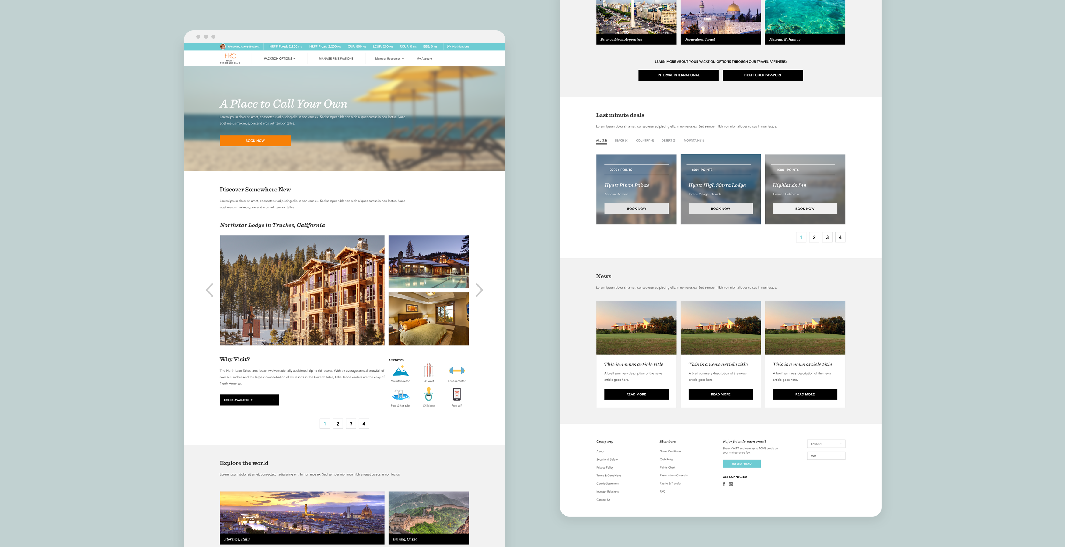
The Hyatt Residence Club is a timeshare program in the U.S. They discovered users were struggling through the booking process and were looking for a complete overhaul of their website. The solution had to scale easily and be optimized for their target demographics.
** Branding and content creation were done cocurrently to the website redesign, therefore, most sections are using FPO copy and images. **
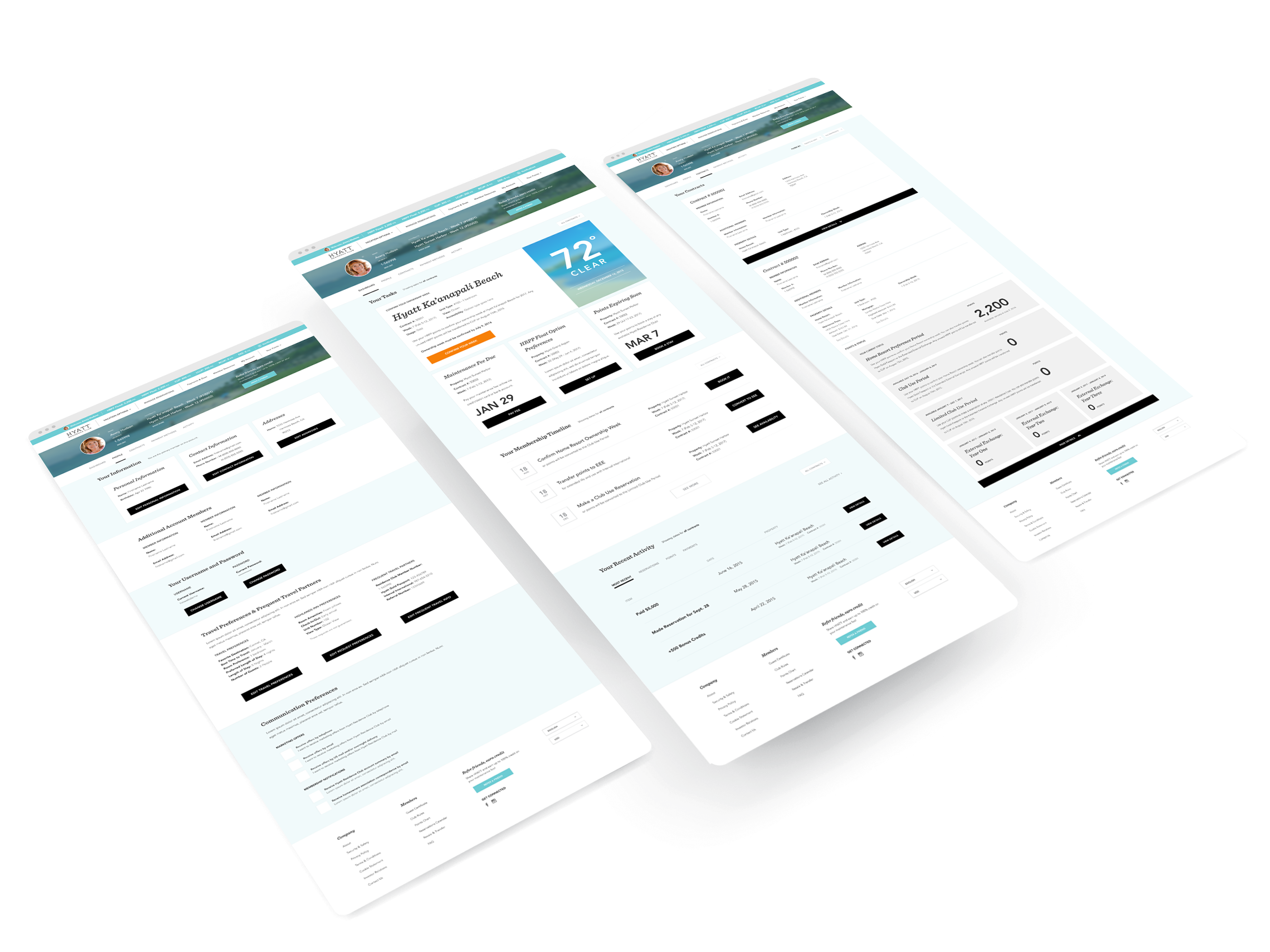
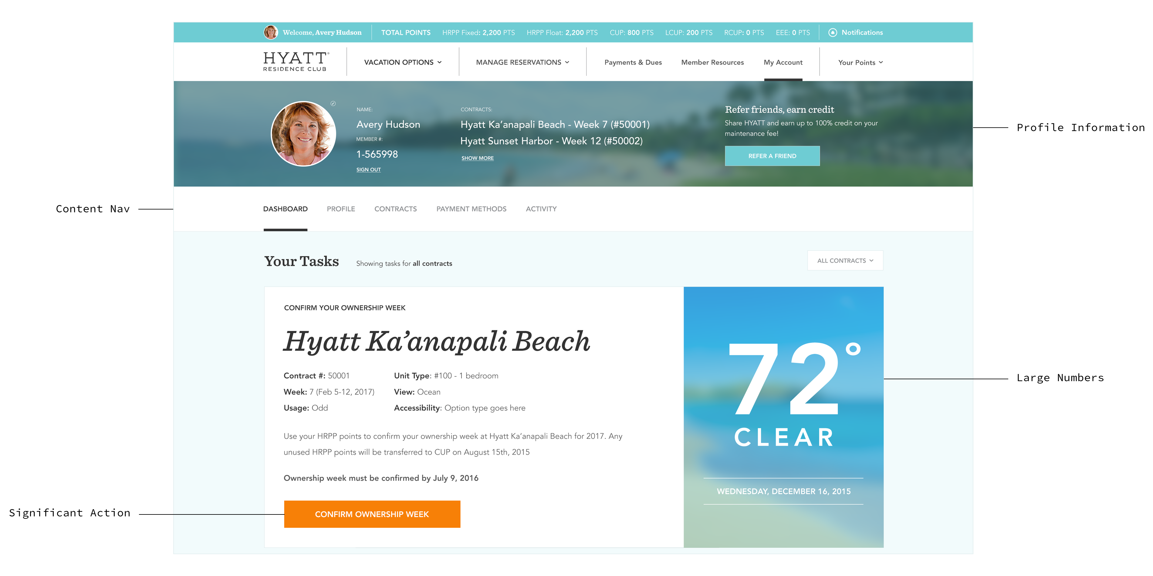
Account Pages
CATERING TO THE AUDIENCE
The target audience is older adults (30-60) most likely with families and in search of an all-in-one experience. I placed user profiles and direct navigation to other pages at the top of the account page to make important information easier to find for a less tech savvy audience. These sections remained sticky as you scrolled down the page. The use of bright colored buttons and large numbers increased visibility of significant actions and key dates.
FLOW DEVELOPMENT
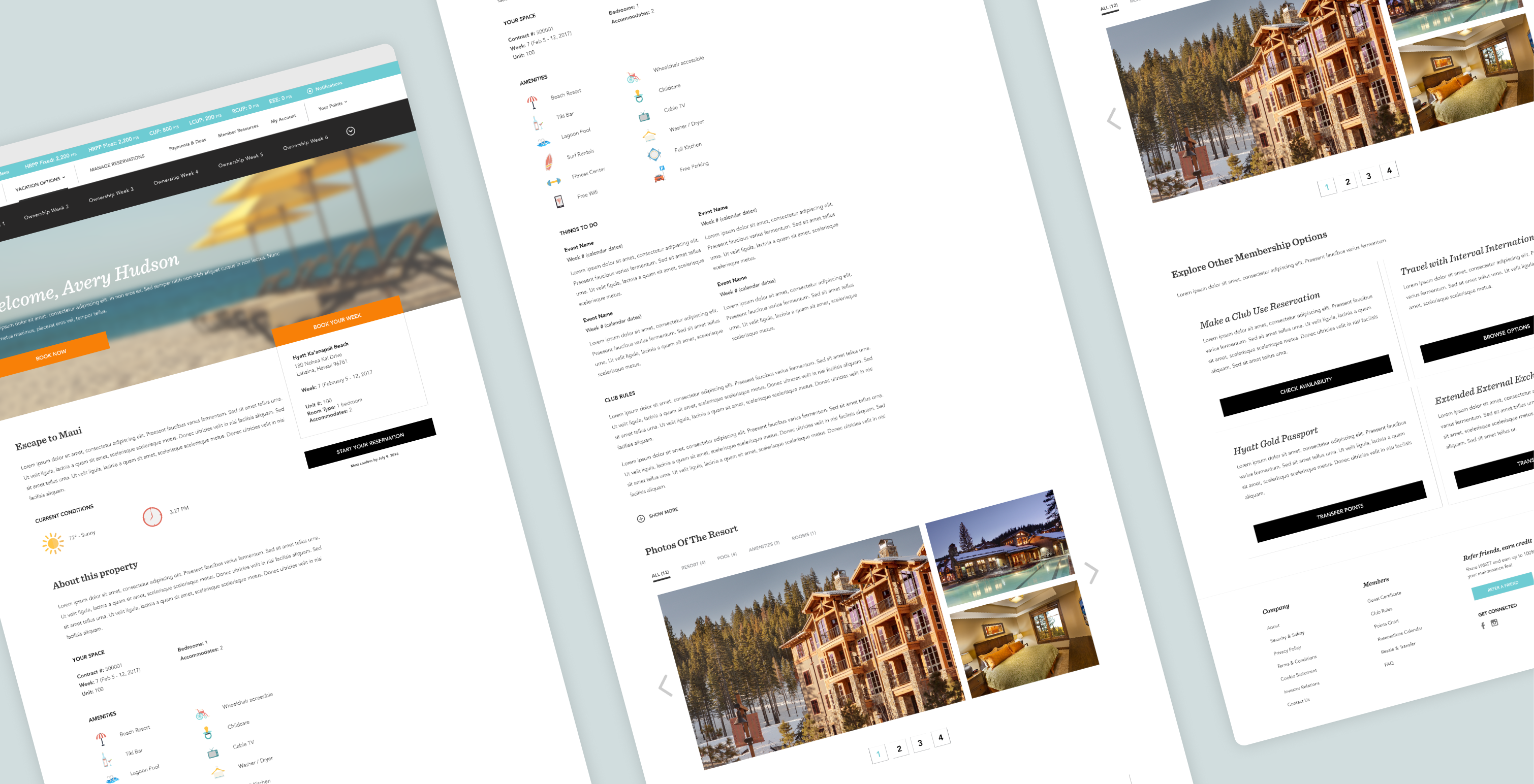
The biggest problem we were tasked to solve was creating a simplified flow to book a time share. Our UX team worked with Hyatt to restructure their sitemap in a thoughtful way. As the UI designer I worked with the UX team to take the basic wire frames and make an easily scalable system that would streamline these flows. I was able to reuse components and modules across this site which simplified the process and enhanced cohesion of the look and feel. Bright CTA’s and limiting tasks per page helped increase understanding of each step in the process. The information entered followed you across the booking process allowing for easy editing and increased awareness of where you were in the flow.
ADDING PERSONALITY
High quality imagery was used to show off Hyatt properties along with their diverse and beautiful locations. These images which I married with expanded brand colors and newly developed icons enhanced brand cohesion and the use of their new brand guidelines. Using these elements gave contrast and added the Hyatt personality to text heavy pages.
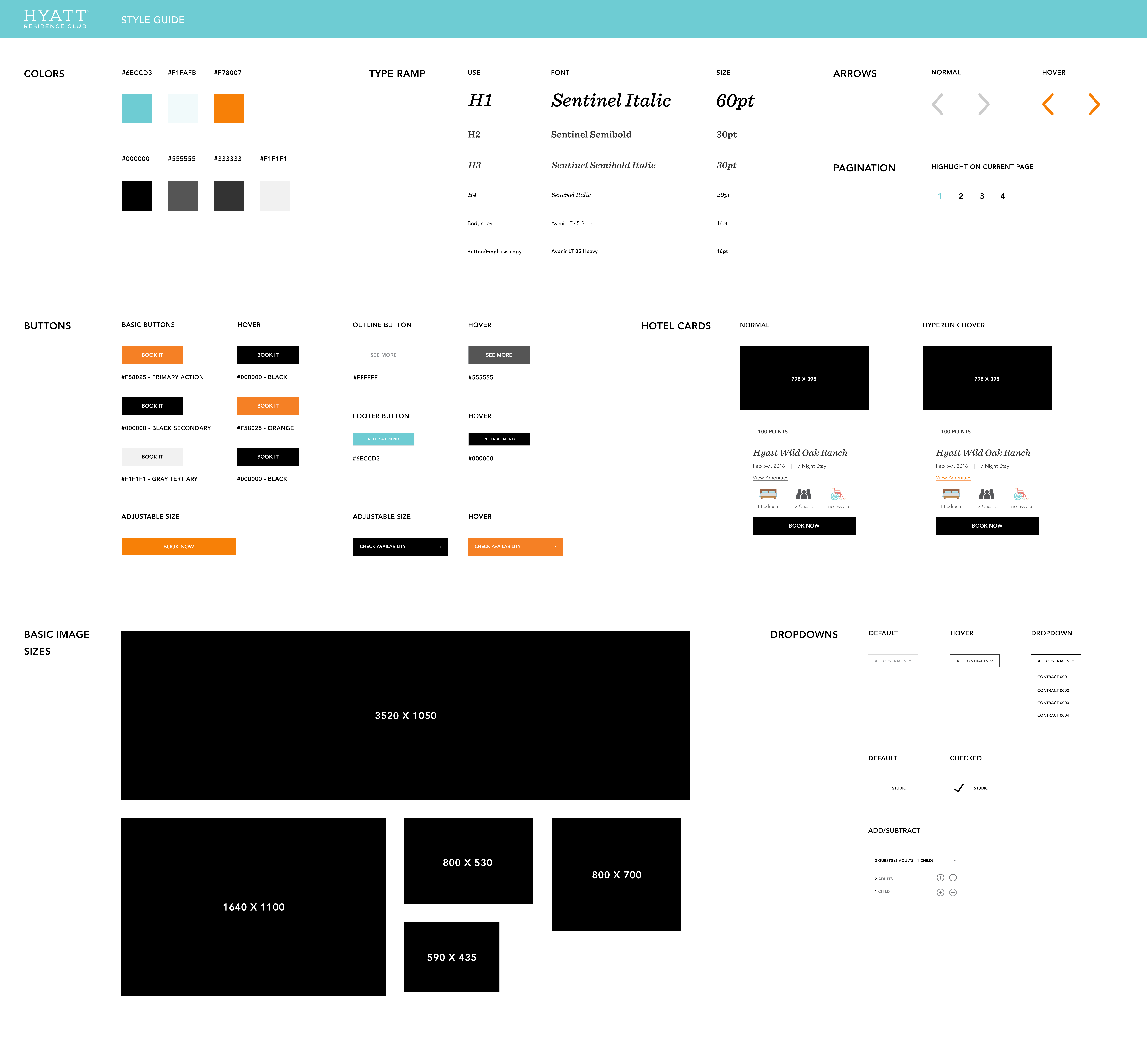
CREATING A STYLE GUIDE
I created a style guide to promote website consistency as well as a smooth handoff to developers. This style guide included brand colors and a type ramp which aligned with their new brand guidelines. Smaller elements were combined to create larger components such as button states and image sizes. These components were embedded into larger complex modules such as hotel cards that were used across many pages of the site. Creating a system from the small elements to larger modules led to a website with greater consistency and uniformity. This also decreased development time by allowed developers to easily answer style questions and add micro animations based on the style guides hover elements.
CHALLENGES AND LEARNING
The discovery process was a challenge our team faced in the beginning. We revamped our approach and internally streamlined our workflow process to accommodate slowdowns in client deliverables. We worked in smaller, more tangible portions of the site which allowed us to solve problems on a granular level and then expand the solutions to other sections as we received more information from the Hyatt team. Much of this process was done in parallel which made it difficult to create a single voice but with our internal process and style guide set up, we were able to be flexible and add new assets on the fly which allowed the site to come together in a cohesive way.